DataTable
Generic sortable data display table.
Description
Generic sortable data display table. Supports custom cell rendering, column sorting, empty states, and horizontal scroll. Used throughout Prometheus UI for flags, statistics, and tabular data display.
✓ Do
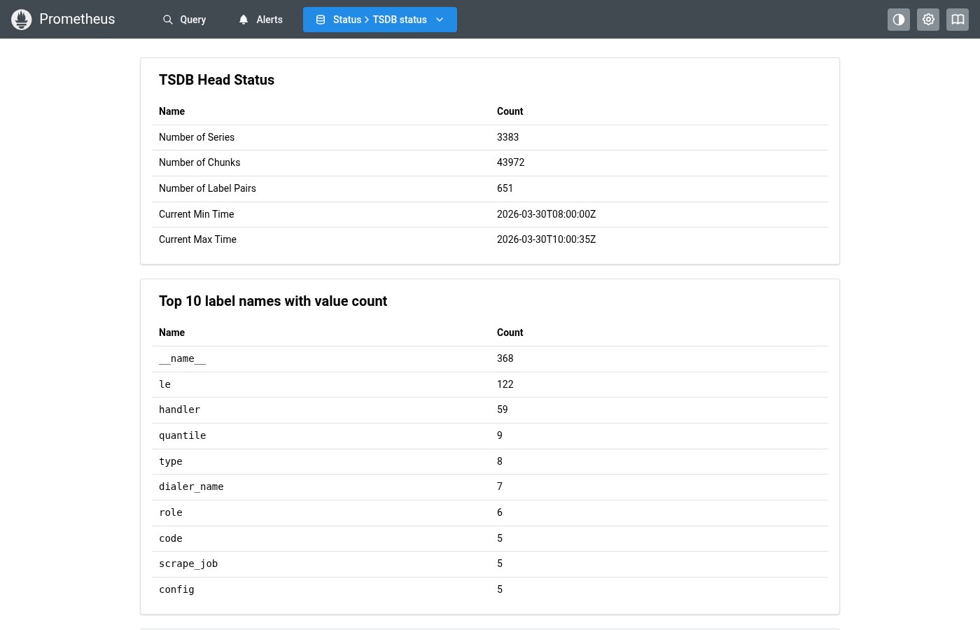
- All tabular data (flags, stats, TSDB info)
- Sortable columns with visual sort indicators
- Use column
renderfor custom cells,rowKeyfor stable keys
✗ Don’t
- Key-value pair display (use KeyValueTable)
- Complex interactive grids with editing
- Custom
<Table>layouts with manual sort logic
Design
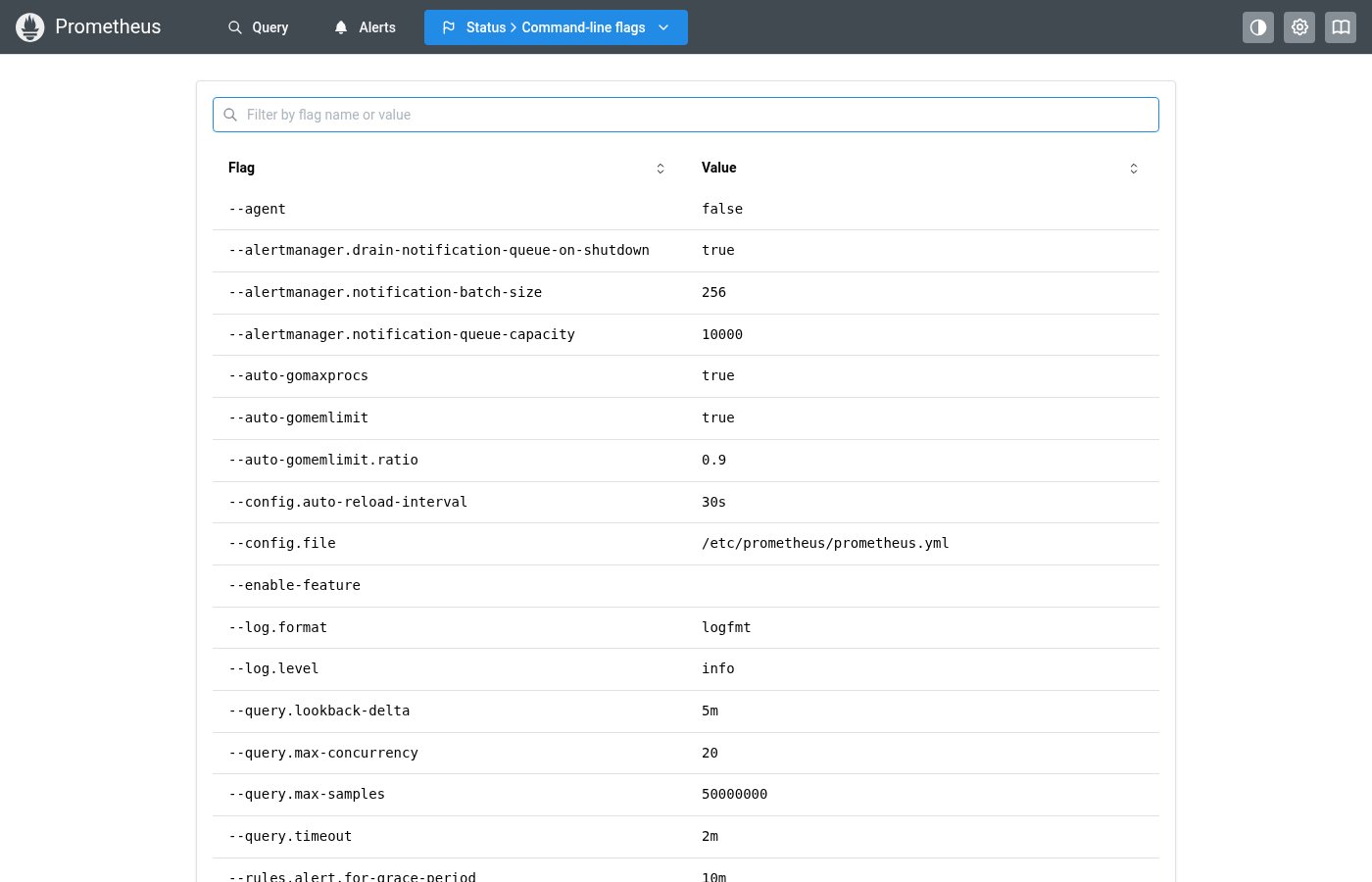
DataTable Example
| Flag ↕ | Value |
|---|---|
| --config.file | /etc/prometheus/prometheus.yml |
| --storage.tsdb.path | /data |
| --storage.tsdb.retention.time | 15d |
| --web.listen-address | 0.0.0.0:9090 |
DataTableColumn Interface
| Property | Type | Description |
|---|---|---|
key | string | Column key / accessor |
header | React.ReactNode | Column header label |
render | (row: T, index: number) => ReactNode | Custom cell renderer |
sortable | boolean | Whether this column is sortable |
align | "left" | "center" | "right" | Column alignment |
truncate | boolean | Whether to truncate long values |
Where this component exists in the Prometheus UI
Implementation
From pages/targets/ScrapePoolsList.tsx in the Prometheus codebase:
<Table>
  <Table.Thead>
    <Table.Tr>
      <Table.Th w="25%">Endpoint</Table.Th>
      <Table.Th>Labels</Table.Th>
      <Table.Th w={230}>Last scrape</Table.Th>
      <Table.Th w={100}>State</Table.Th>
    </Table.Tr>
  </Table.Thead>
  <Table.Tbody>
    {items.map((target, i) => (
      <Table.Tr key={i}>
        <Table.Td>
          <EndpointLink endpoint={target.scrapeUrl} globalUrl={target.globalUrl} />
        </Table.Td>
        <Table.Td>
          <TargetLabels labels={target.labels} />
        </Table.Td>
        <Table.Td>
          <Badge className={healthBadgeClass(target.health)}>{target.health}</Badge>
        </Table.Td>
      </Table.Tr>
    ))}
  </Table.Tbody>
</Table>
Layout Specs
| Property | Value |
|---|---|
| Cell Padding | 6px 12px (0.375rem 0.75rem) |
| Header Padding | 8px 12px (0.5rem 0.75rem) |
| Header Border Bottom | 2px solid |
| Cell Border Bottom | 1px solid |
| Font Size | 12px (xs) default |
| Header Font Size | 11px |
| Min Height | auto (content-driven) |
Accessibility
- Sortable column headers have
role="button"andtabIndex={0} - Sort state communicated via
aria-sortattribute - Keyboard support: Enter/Space to toggle sort on column headers
- Empty state uses centered dimmed text