InfoCard
A Card with a consistent icon + title header for status and info pages.
Description
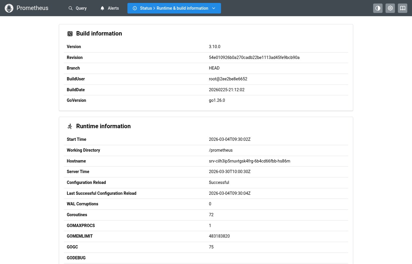
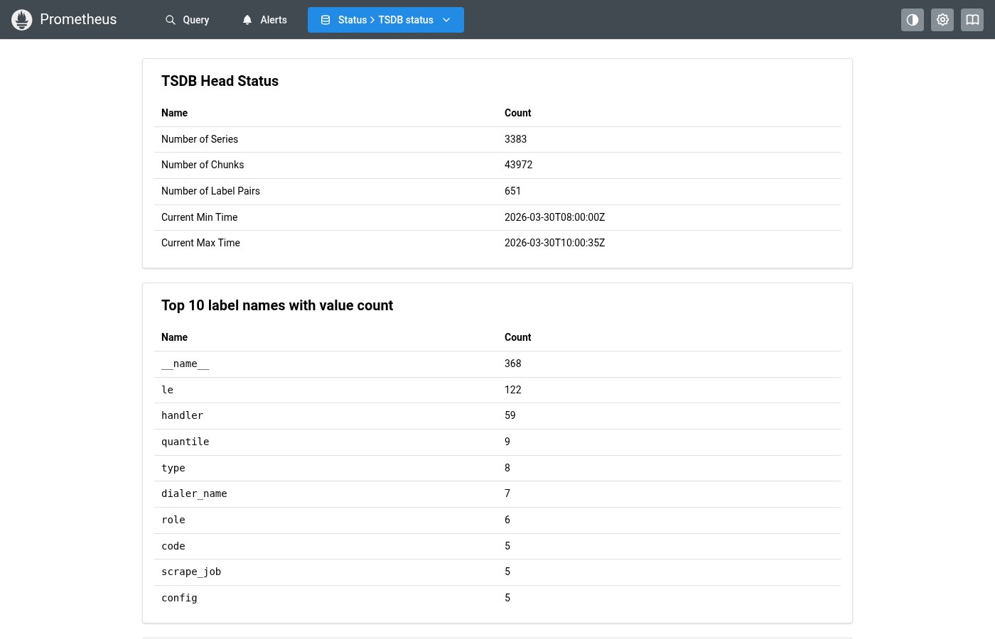
A Card with a consistent icon + title header for status and info pages. Equivalent to InfoPageCard in the Prometheus source. Used on StatusPage, TSDBStatusPage, AgentPage, and FlagsPage.
✓ Do
- Status/info pages with categorized information
- Content with icon + title header pattern
- Wrapping KeyValueTable or DataTable content
✗ Don’t
- Full-width content without need for a card wrapper
- Interactive cards needing click handlers (use a button)
- Accordion items (use HealthPanel)
Design
InfoCard with title and icon
Runtime Information
| Version | 2.47.0 |
| Go Version | go1.21.5 |
| Uptime | 3d 14h 22m |
Where this component exists in the Prometheus UI
Implementation
From components/InfoPageCard.tsx in the Prometheus codebase:
const InfoPageCard: FC<{
  children: ReactNode;
  title?: string;
  icon?: React.ComponentType<IconProps>;
}> = ({ children, title, icon: Icon }) => {
  return (
    <Card shadow="xs" withBorder p="md">
      {title && (
        <Group wrap="nowrap" align="center" ml="xs" mb="sm" gap="xs" fz="xl" fw={600}>
          {Icon && <Icon style={infoPageCardTitleIconStyle} />}
          {title}
        </Group>
      )}
      {children}
    </Card>
  );
};
Layout Specs
| Property | Value |
|---|---|
| Padding | 16px (md) default |
| Border Radius | 8px (md) |
| Border Width | 1px |
| Shadow | xs (--mantine-shadow-xs) |
| Header Icon Size | 18px |
| Header Gap | 8px (0.5rem) |
| Header Title Font Size | 18px (lg) |
| Header Title Font Weight | 600 (semibold) |
Accessibility
- Card has semantic
articlestructure via Mantine Card - Title uses heading-level font size for visual hierarchy