FilterToolbar
Unifies the 4 different filter bars in the Prometheus codebase: AlertsPage, RulesPage, TargetsPage, and ServiceDiscoveryPage.
Description
Unifies the 4 different filter bars in the Prometheus codebase: AlertsPage, RulesPage, TargetsPage, and ServiceDiscoveryPage. Provides search input, state multi-select, and optional collapse/expand button.
✓ Do
- Any page with filterable list content
- Pages that need state/health filtering
- Pages with collapsible panels needing collapse-all
✗ Don’t
- Simple text-only search (use a plain TextInput)
- Complex multi-dimension filters beyond state + text
- Custom filter bars with separate Group + StateMultiSelect + TextInput
Design
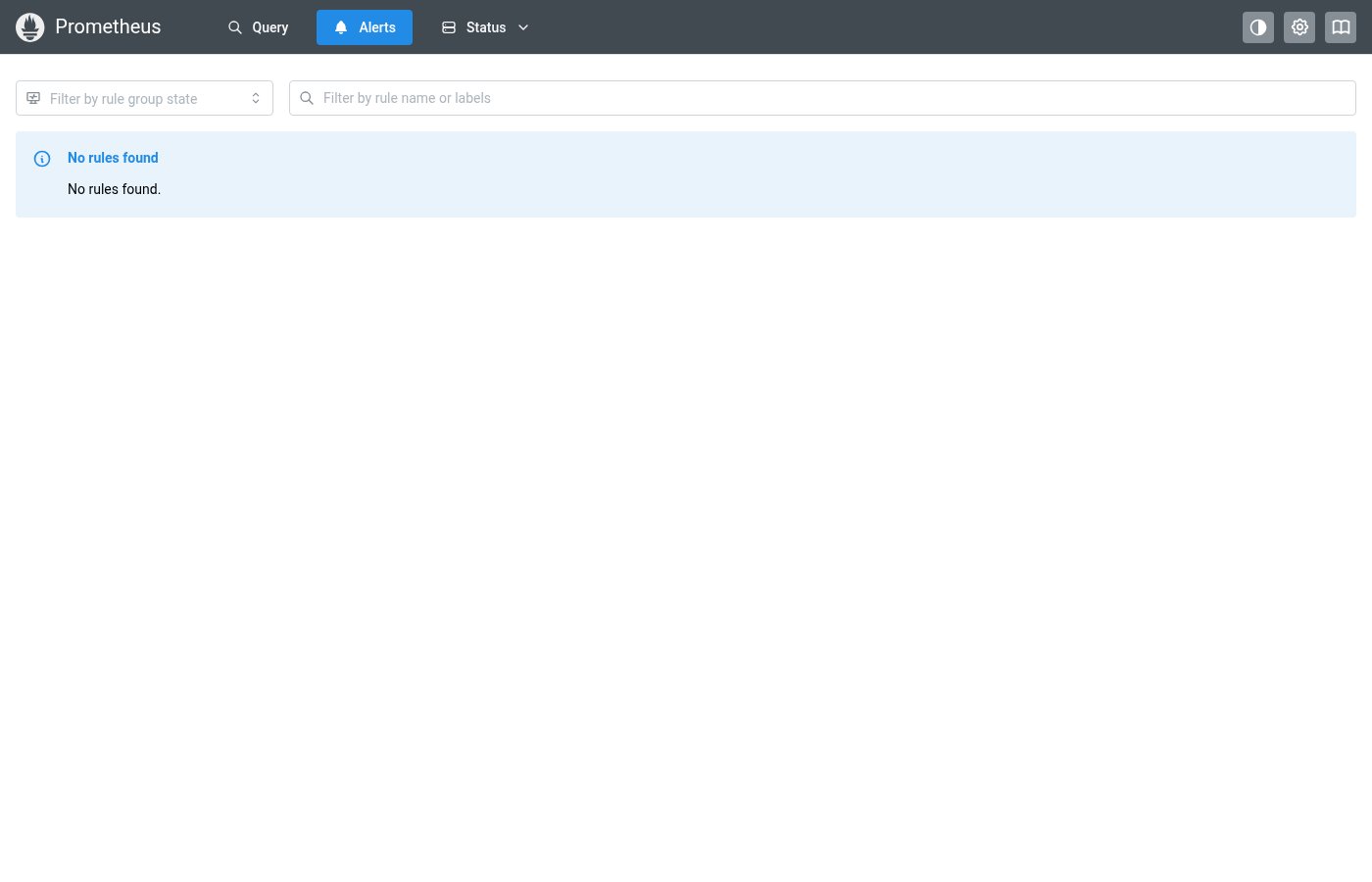
AlertsPage / RulesPage Style
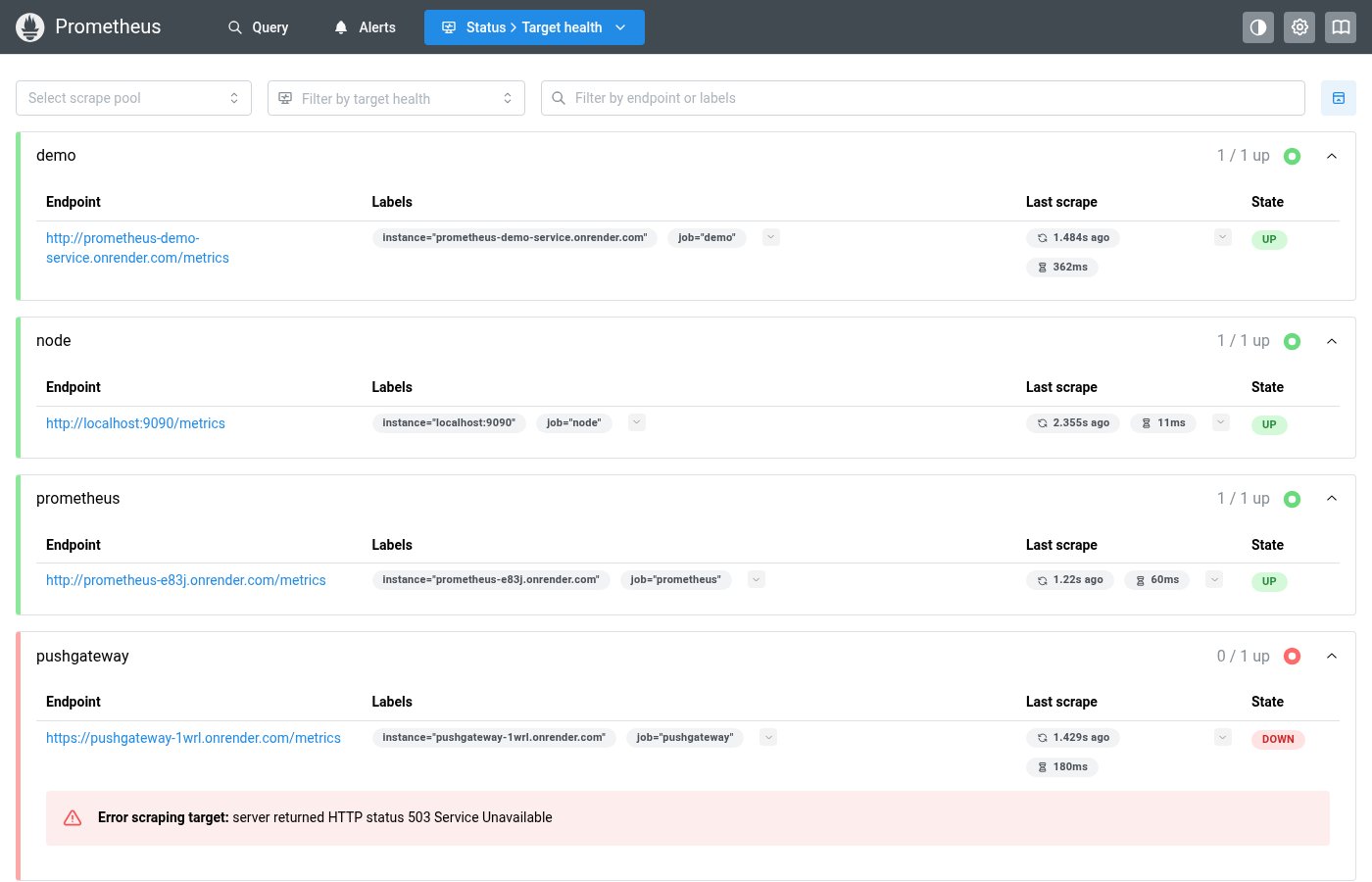
TargetsPage Style (with collapse button)
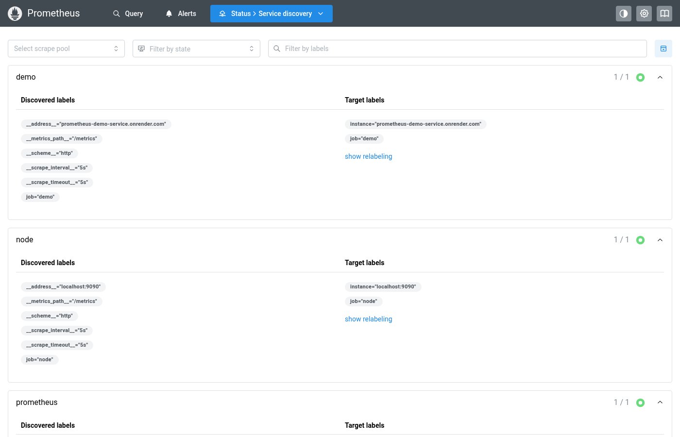
Where this component exists in the Prometheus UI
Implementation
From pages/AlertsPage.tsx in the Prometheus codebase:
<Group>
  <StateMultiSelect
    options={["inactive", "pending", "firing", "unknown"]}
    optionClass={(o) =>
      o === "inactive"
        ? badgeClasses.healthOk
        : o === "pending"
          ? badgeClasses.healthWarn
          : o === "firing"
            ? badgeClasses.healthErr
            : badgeClasses.healthUnknown
    }
    placeholder="Filter by rule group state"
    values={stateFilter || []}
    onChange={(values) => setStateFilter(values)}
  />
  <TextInput
    flex={1}
    leftSection={<IconSearch style={inputIconStyle} />}
    placeholder="Filter by rule name or labels"
    value={searchFilter || ""}
    onChange={(event) =>
      setSearchFilter(event.currentTarget.value || null)
    }
  />
</Group>
Layout Specs
| Property | Value |
|---|---|
| Gap | 12px (sm) default |
| Search Input Height | 32px |
| Select Height | 32px |
| Icon Button Size | 32px × 32px |
| Border Radius (inputs) | 4px (default) |
| Border Width | 1px |
| Min Width (select) | 180px |
Accessibility
- Search input has
aria-label="Search filter" - Collapse button has descriptive
aria-labelandtitle - StateMultiSelect inherits Mantine Combobox accessibility