InfoPageLayout
Centered, max-width page layout wrapper for status/info pages.
Description
Centered, max-width page layout wrapper for status/info pages. Sets a max-width of 1000px and appropriate top margin. Equivalent to InfoPageStack in the Prometheus source.
✓ Do
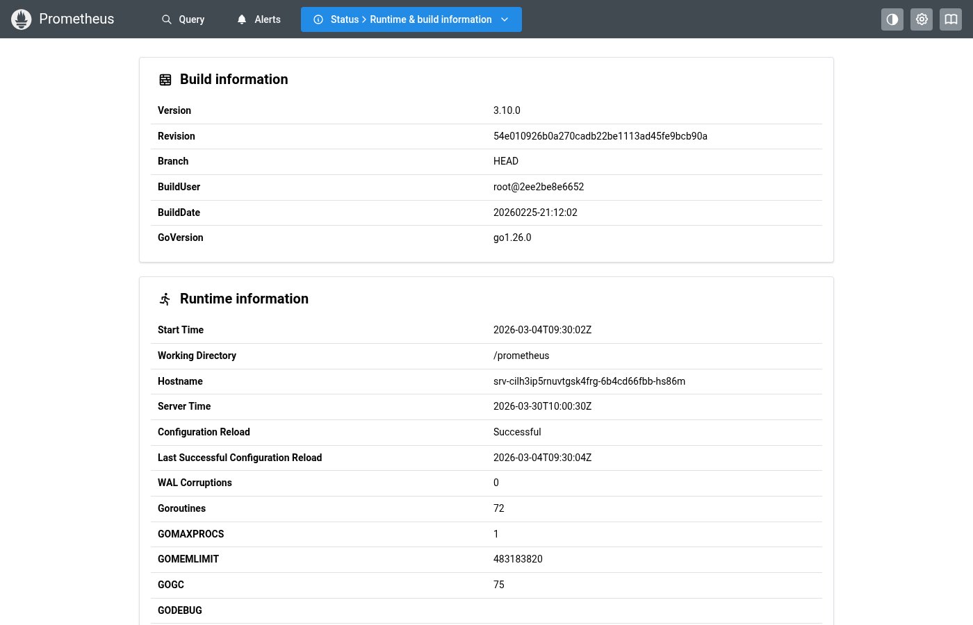
- Info/status pages (status, build info, TSDB, flags)
- Pages composed of multiple InfoCard components
- Consistent centering and max-width for content pages
✗ Don’t
- List/accordion pages (Alerts, Rules, Targets)
- Query page (uses its own custom layout)
- Hardcoding
maw={1000}on individual Stacks
Design
Layout Structure
max-width: 1000px, centered
Card 1
Card 2
Where this component exists in the Prometheus UI
Implementation
From components/InfoPageStack.tsx in the Prometheus codebase:
const InfoPageStack: FC<{ children: ReactNode }> = ({ children }) => {
  return (
    <Stack gap="lg" maw={1000} mx="auto" mt="xs">
      {children}
    </Stack>
  );
};
Layout Specs
| Property | Value |
|---|---|
| Max Width | 1000px |
| Gap | 20px (lg) default |
| Margin Top | 8px (xs) default |
| Padding | 0 (handled by AppShell main padding 16px) |
Accessibility
- Provides a centered, readable content width
- Does not add semantic landmark — use within a
<main>element