StatusBadge
Unified health/state badge that resolves the fragmented badge system in the Prometheus UI.
Description
Unified health/state badge that resolves the fragmented badge system in the Prometheus UI. A single component handles all status vocabularies across alerts, rules, targets, and service discovery pages.
✓ Do
- All health/state display across alerts, targets, rules, and SD pages
- Pass the raw status string and let the component normalize it
- Neutral counts via the stats variant
✗ Don’t
- Decorative coloring unrelated to health state
- Interactive elements (use a button instead)
- Mantine Badge with manual color props or separate per-page badge implementations
Design
Health Variants
up
ok
active
down
firing
err
pending
stale
info
unknown
inactive
dropped
Sizes
sm
md (default)
lg
Stats Variant (neutral)
3 / 3 active
42 targets
0 rules
Status Normalization
All status vocabularies are normalized to five canonical states:
| Canonical | Color | Input Aliases |
|---|---|---|
| ok | Green | ok, up, active |
| err | Red | err, down, firing |
| warn | Yellow | warn, pending, stale |
| info | Blue | info |
| unknown | Gray | unknown, inactive, dropped, none |
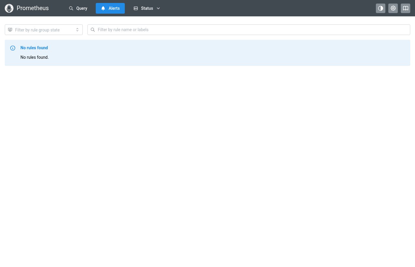
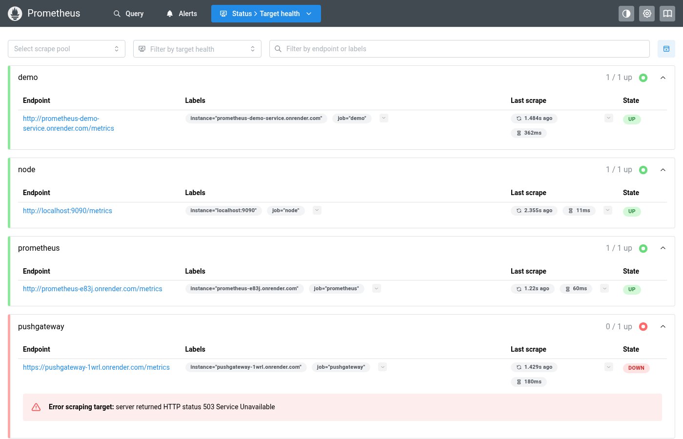
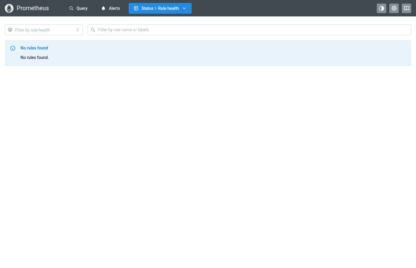
Where this component exists in the Prometheus UI
Implementation
From Badge.module.css + pages/AlertsPage.tsx in the Prometheus codebase:
/* Badge.module.css */
.healthOk {
  background-color: light-dark(
    var(--mantine-color-green-1),
    var(--mantine-color-green-9)
  );
  color: light-dark(var(--mantine-color-green-9), var(--mantine-color-green-1));
}

.healthErr {
  background-color: light-dark(
    var(--mantine-color-red-1),
    darken(var(--mantine-color-red-9), 0.25)
  );
  color: light-dark(var(--mantine-color-red-9), var(--mantine-color-red-1));
}

/* AlertsPage.tsx usage */
{g.counts.firing > 0 && (
  <Badge className={badgeClasses.healthErr}>
    firing ({g.counts.firing})
  </Badge>
)}
Layout Specs
| Property | sm | md | lg |
|---|---|---|---|
| Height | 20px | 22px | 26px |
| Padding (horizontal) | 8px | 10px | 12px |
| Font Size | 10px | 11px | 12px |
| Border Radius | 999px (pill) | ||
| Border Width | none | ||
| Letter Spacing | 0.02em | ||
Accessibility
- Includes
aria-label="Status: {displayLabel}"for screen readers - Uses semantic color that doesn't rely on color alone — text label always visible
- Text contrast meets WCAG AA for all color/background combinations