StateMultiSelect
Colored pill multi-select for state/health filtering.
Description
Colored pill multi-select for state/health filtering. Renders health states as colored pills in the input. Used inside FilterToolbar but can be used standalone.
✓ Do
- Filtering by health/operational state
- Multi-select where options have color coding
- Part of FilterToolbar composition
✗ Don’t
- Generic multi-select without color coding (use Mantine MultiSelect)
- Single-select state filter
- Plain Mantine MultiSelect for health states (no colored pills)
Design
StateMultiSelect (selected states)
firing
pending
×
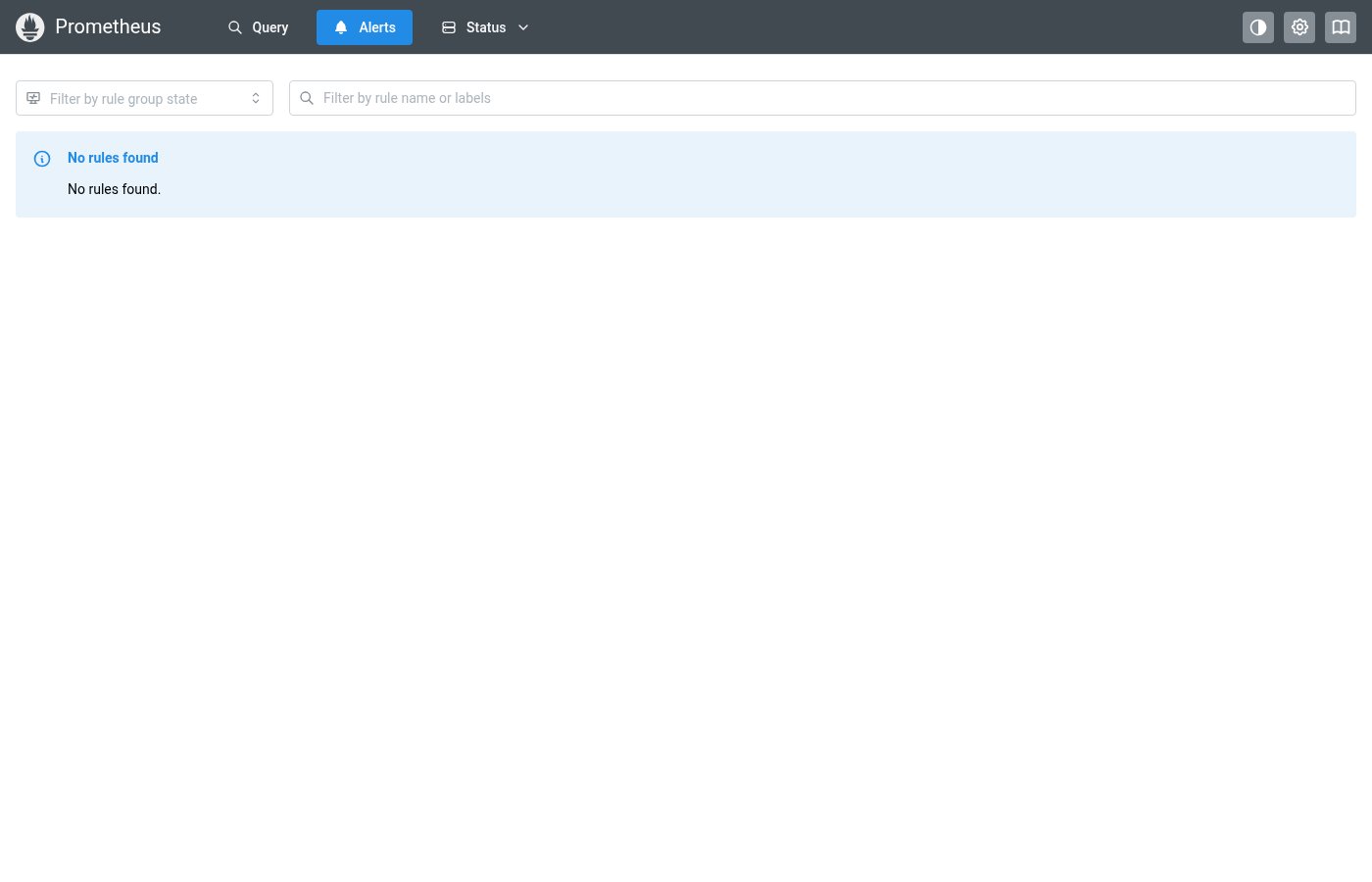
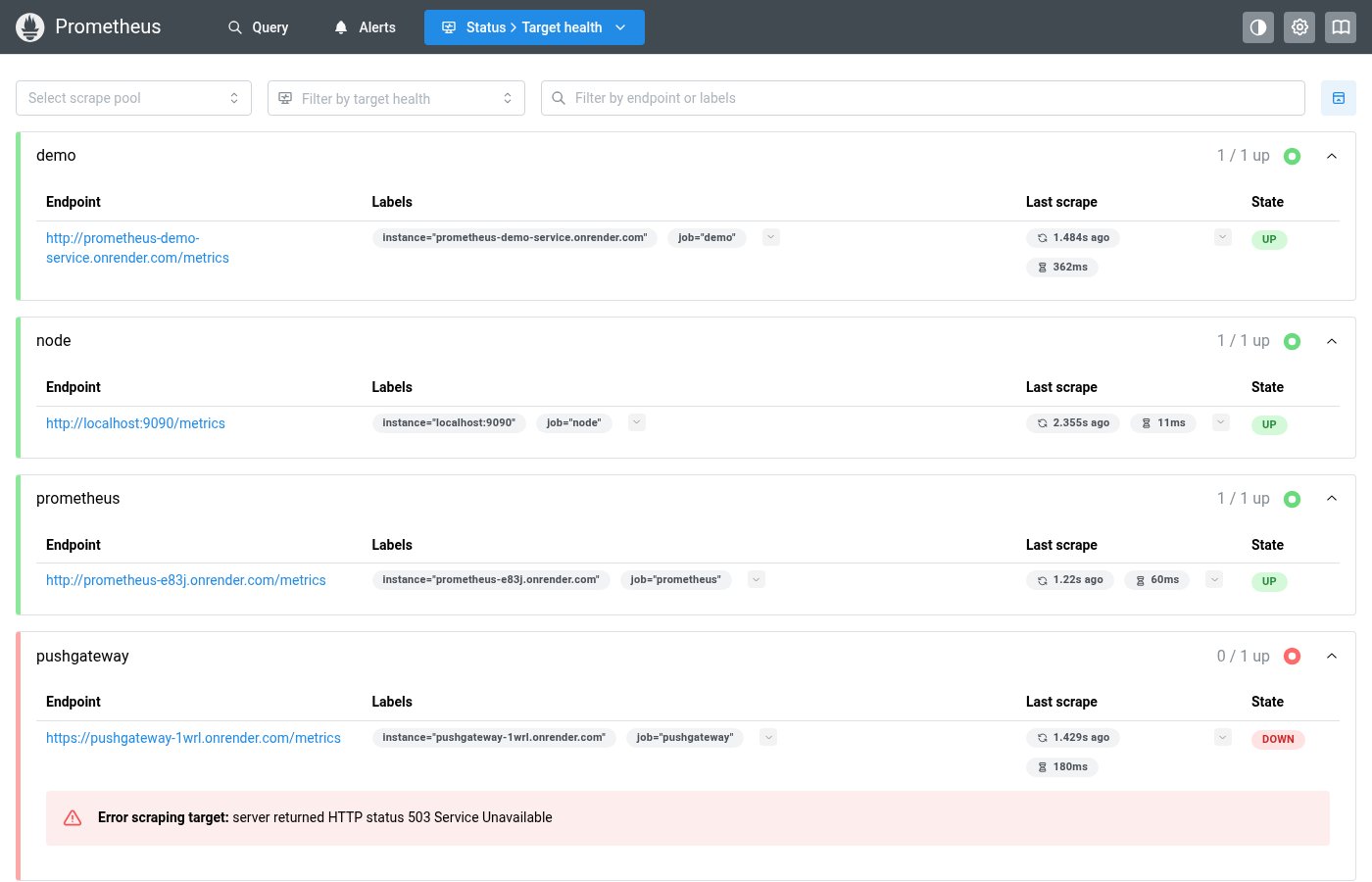
Where this component exists in the Prometheus UI
Implementation
From components/StateMultiSelect.tsx in the Prometheus codebase:
<Combobox store={combobox} onOptionSubmit={handleValueSelect}>
  <Combobox.DropdownTarget>
    <PillsInput pointer onClick={() => combobox.toggleDropdown()} miw={200}
      leftSection={<IconHeartRateMonitor style={inputIconStyle} />}>
      <Pill.Group>
        {renderedValues.length > 0 ? renderedValues : (
          <PillsInput.Field placeholder={placeholder} mt={1} />
        )}
      </Pill.Group>
    </PillsInput>
  </Combobox.DropdownTarget>
  <Combobox.Dropdown>
    <Combobox.Options>
      {options.map((value) => (
        <Combobox.Option value={value} key={value} active={values.includes(value)}>
          <Group gap="sm">
            {values.includes(value) ? <CheckIcon size={12} /> : null}
            <StatePill value={value} className={optionClass(value)} />
          </Group>
        </Combobox.Option>
      ))}
    </Combobox.Options>
  </Combobox.Dropdown>
</Combobox>
Layout Specs
| Property | Value |
|---|---|
| Input Height | 32px |
| Input Min Width | 180px |
| Border Radius | 4px (default) |
| Border Width | 1px |
| Font Size | 13px |
| Dropdown Shadow | md (--mantine-shadow-md) |
Accessibility
- Built on Mantine Combobox for keyboard navigation
- Selected pills are colored by health state
- Dropdown supports keyboard selection and deselection