PoolAccordion
Accordion component for scrape pool and target group display.
Description
Accordion component for scrape pool and target group display. Combines HealthPanel with pool-specific header layout including stats badges and target counts.
✓ Do
- Targets page scrape pool groups
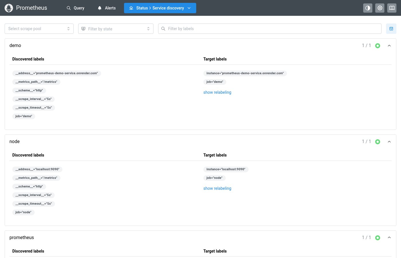
- Service Discovery discovered pool groups
- Any grouped list with health status and counts
✗ Don’t
- Alert/rule groups (use HealthPanel directly)
- Non-grouped content
- Custom accordion layouts with manual health borders
Design
PoolAccordion Example
▸ prometheus
3 up3 targets
▸ node_exporter
2 up1 down3 targets
PoolAccordionItemProps
| Property | Type | Description |
|---|---|---|
name | string | Pool name (used as accordion value) |
status | HealthPanelStatus | Overall pool health |
stats | PoolStats | Pool statistics (counts per state) |
children | React.ReactNode | Panel content |
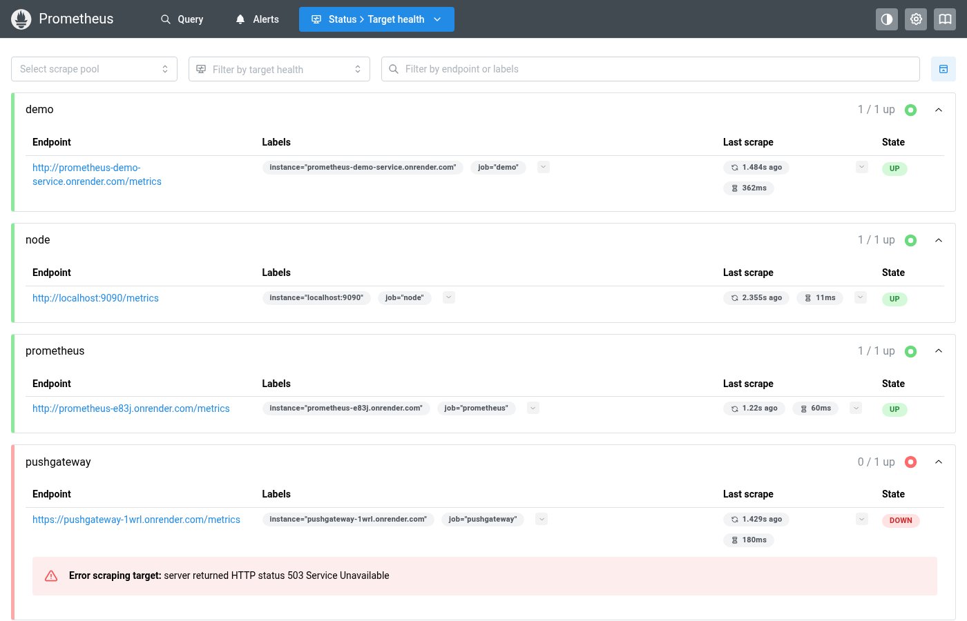
Where this component exists in the Prometheus UI
Implementation
From pages/targets/ScrapePoolsList.tsx in the Prometheus codebase:
<Accordion multiple variant="separated" keepMounted={false}
  value={allPoolNames.filter((p) => !collapsedPools.includes(p))}
  onChange={(value) =>
    dispatch(setCollapsedPools(allPoolNames.filter((p) => !value.includes(p))))
  }
>
  {shownPoolNames.map((poolName) => {
    const pool = allPools[poolName];
    return (
      <Accordion.Item key={poolName} value={poolName}
        className={poolPanelHealthClass(pool)}>
        <Accordion.Control>
          <Group wrap="nowrap" justify="space-between" mr="lg">
            <Text>{poolName}</Text>
            <Text c="gray.6">{pool.upCount} / {pool.count} up</Text>
          </Group>
        </Accordion.Control>
      </Accordion.Item>
    );
  })}
</Accordion>
Layout Specs
| Property | Value |
|---|---|
| Item Border Radius | 6px |
| Item Border Width | 1px |
| Item Margin Bottom | 8px |
| Header Padding | 10px 16px (0.625rem 1rem) |
| Panel Left Border | 5px (via HealthPanel) |
| Title Font Size | 14px (sm) |
| Title Font Weight | 600 (semibold) |
| Stats Badge Gap | 6px (0.375rem) |
Accessibility
- Inherits Mantine Accordion keyboard navigation
- Health status conveyed through HealthPanel border colors