EmptyState
Centered empty state display with icon, message, description, and optional action.
Description
Centered empty state display with icon, message, description, and optional action. Used when filter results are empty, data hasn't loaded, or there are genuinely no items to display.
✓ Do
- Empty filter results or zero items in a list
- No data loaded yet / first-time empty state
- Always provide a descriptive message
✗ Don’t
- Loading states (use Skeleton or LoadingOverlay)
- Error states (use ErrorAlert)
- Empty tables with no user-facing indication
Design
EmptyState Example
No targets found
No scrape targets match your current filter.
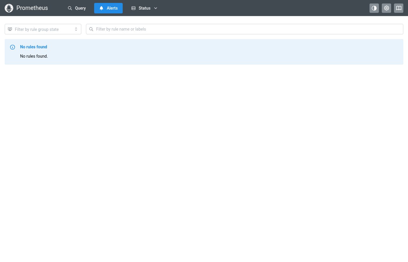
Where this component exists in the Prometheus UI
Implementation
From pages/AlertsPage.tsx in the Prometheus codebase:
{alertsPageData.groups.length === 0 ? (
  <Alert title="No rules found" icon={<IconInfoCircle />}>
    No rules found.
  </Alert>
) : (
  !showEmptyGroups &&
  alertsPageData.groups.length !== shownGroups.length && (
    <Alert title="Hiding groups with no matching rules" icon={<IconInfoCircle />}>
      Hiding {alertsPageData.groups.length - shownGroups.length} empty groups.
      <Anchor ml="md" fz="1em" onClick={() => setShowEmptyGroups(true)}>
        Show empty groups
      </Anchor>
    </Alert>
  )
)}
Layout Specs
| Property | Value |
|---|---|
| Padding (vertical) | 32px (xl) default |
| Gap | 12px (sm) default |
| Icon Size | 40px |
| Icon Opacity | 0.3 |
| Message Font Weight | 500 (medium) |
| Description Font Size | 13px |
| Text Align | center |
Accessibility
- Icon has
aria-hidden="true"(decorative) - Message text is the primary accessible content
- Action element should be a focusable button or link